Judge a Pokemon: The Smog's 3rd Art Panel
| « Previous Article | Home | Next Article » |
Introduction
Welcome everyone, to the third installation of Judge a Pokemon, where commentator's from the Smeargle Studio community come together to give you our brutally honest opinions of Game Freak's Pokemon designs! This installation, we're bringing you fewer Pokemon-- in exchange for more reviews! All four of our previous judges are back, and we welcome back Alchemator to the crew! I promise this will be another delightful round of judging!
Reference: Kinneas's comments are in red, Swaggersaurus's are in yellow, Chou Toshio's are in green, Alchemator's are in blue, and Fatecrashers's are in beige.
1. Ferrothorn
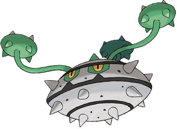

Yay I'm back! Anyway on with the show... To be quite honest, I don't think I need to say much as to why this is a bad design - just read through the endless debates about what it actually is to get a good idea. Is it a crushed Durian fruit? Is it this? Is it that? All I know is that it isn't cuddly (too spikey) and that you can't use it as a frisbee (doesn't learn Rapid Spin, also the vines would pimp-slap you). The color scheme is bland too. Probably one of my least favourite designs. Gyro ball? More like Gyro appal!

Ferrothorn is 242 lbs of awesome. I was hoping all 4th gen that Game Freak would release a big FU to bulky Water-types, and Ferrothorn really sticks it to them! Not only is this competitive cabbage a bad ass, he looks like one too! Until now, I have never thought that a Grass-type looked bad ass, but Ferrothorn looks bad ass. From it's sharp spiny carapace to its snake-like vines and strikingly cruel yellow eyes, it is simply an awesome design. For a Steel-type he might not be too shiny, but he's shinier than you meat bag.

I'm not sure what to think of this Pokemon. On the one hand, it's just an ugly spiky thing with some mean eyes; on the other hand, if you had asked me to design a Grass / Steel type, the idea of a metallic durian fruit would never cross my mind in a million years, so kudos to the Game Freak design department on that one. The color scheme of gray and green isn't very creative, but I guess it does what it needs to achieve.

Ugh it is so ugly. I mean what is it even supposed to be? A durian? Did you know that durians smell really bad? From Wikipedia: "The smell evokes reactions from deep appreciation to intense disgust, and has been described variously as almonds, rotten onions, turpentine, and gym socks. The odour has led to the fruit's banishment from certain hotels and public transportation in southeast Asia." So bad it is banned. I guess it is fitting that Game Freak made this design stink, too. Hohoho.

I like Forretress and I always have, despite rarely using it in a competitive sense. I remember it being one of those Pokémon that I never really saw in-game, in fact I was probably unaware of its existence for most of my 11 year Pokémon playing career. So when I accidentally came across a Pineco whilst searching for Heracross, it was a nice surprise. I think Forry's vacant, expressionless eyes are actually quite adorable and it's... ... ... What? What do you mean it's not a Forretress? Oh shi-uh, Ferrothorn looks like a UFO with pigtails. I guess some people would be into that sort of thing... I still prefer Forretress.
2. Scraggy
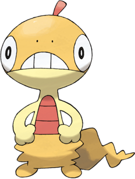
I just don't get it. Scraggy and Scrafty have kind of generated a cult following of sorts, making them a fifth gen mascot. Why, because they look terrible? Is this the same deal as with Wooper and Quagsire? Did people like those designs because they were so bad they couldn't be hated? Scraggy is "apparently" based on some sort of lizard. It looks like a flat sock to me. Or a discarded puppet. I wonder why!! If there's anything I like about Scraggy, I guess the color scheme is okay. I would cite his goofy expression, but thinking about it reminds me of what he turns into and oh god. Let's put it this way -- if Scraggy is terrible, I have no words to describe Scrafty.
Ok, maybe I'm just incredibly cynical this time around (maybe it's the chance from Pidove to Elgyem, who is uncannily like Marvin the robot), but I don't particularly like this guy either. Granted, it's wearing shorts, and that alone makes it cool[er]. Granted, its D: face makes it kind of cute. The problem is that it doesn't particularly evoke any kind of emotion other than awkwardness. Game Freak totally should have given it a sombrero, then I'd love it.
Oh, come on guys, you're hatin' on Scraggy? Seriously? I honestly think Scraggy is one of the better, if not the best design of the 5th generation. It's right up there with Bouffalant because it has character and personality. Just by giving it a gimmick such as not being able to keep its pants up, it immediately adds some dimension to the Pokémon. Scraggy is cute too, and his cult following is well deserved. Look at his round little head. The Karl Pilkington of Pokémon.
"I like shorts, they're comfortable and easy to wear." How can you not like the pants-lizard? This stylin' reptile is all the rage, and totally brings quirky to Pokemon. Scraggy's design is just so bizarre, and his face has just the right amount of "derp." I was laughing pretty hard first time I saw him in game trying to keep his pants up. If there's anything you have to admit about this little lizard, is he has the confidence; he's not afraid to let the whole world see!
Is that a lizard in those pants or are you just happy to see me? Scraggy and its evolution Scrafty are two of my favorites from the new generation. Never mind the fact that they're a thinly-veiled parody of inner city hoodlums circa 1985, there's just something about them that makes them adorable and badass at the same time. Is it the baggy pants? The round head with the dopey expression? The nice warm color scheme of red and orange? Either way, pant lizard is going to take you by storm, competitively and aesthetically.
3. Gurdurr
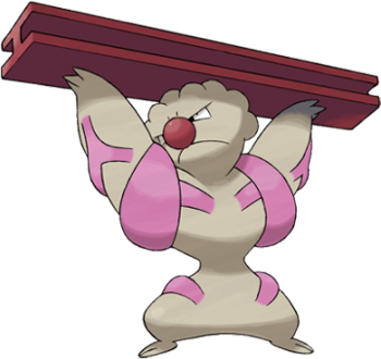
Durr... this has got to be one of the least inspired designs of BW. I mean, it's a just a generic buff humanoid, with a big nose and some warts on its head to make it look uglier. The only thing unique about him is he's carrying an iron girder (haha, brilliant naming sense Game Freak America...). Gimmicky add-on items are not my idea of brilliant design. For the most part, Pokemon really shouldn't have items separate from their bodies anyway, as they are animals occurring in nature. Of course designs like Cubone and Farfetch'd have items they carry, but that doesn't mean it's good design... also, these items are much more natural than Girderr randomly carrying an iron construction bar. I am simply not a fan of this design.
Man Chou Toshio didn't even give Game Freak a chance when he chose this set of designs. I thought this article was "Judge a Pokemon", not "trash all designs ever ever", but I'm kinda gonna have to -- this mon is so ugly. Actually, that's not fair. Gurdurr is supposed to be ugly, I think, in a brutish way. I find the mon unappealing in a different way to Ferrothorn and Scraggy. I don't like their designs, but Gurdurr is ugly as a part of its design, so I guess that's okay? No one can really tell me what Gurdurr is. I mean, he's a guy carrying a girder, basically, but that's self-evident, right? Bulbapedia thinks he might be a construction worker, or a carnie, a muscleman, god knows what. I'm personally not a fan of his ugly braces, and the stylized popping veins are kinda so-so, but I do like his head! Perhaps he reminds me of Graveler with that rough stubbly texture. That was a great looking mon!
Oof, yet another negative review from me. I must be having a very cynical day today. Now, don't get me wrong, I think Timburr is awesome. In fact, I even quite like Conkeldurr, though it would be better if it was bigger (check out its size, it's actually pretty small). Gurdurr, however, like most middle-stage Pokémon, is just awkward in design. It's stuck between the cuteness of Timburr and the manliness of Conkeldurr, and only has a pseudo-fro to make up for things. It also abandons that kinda nice beige skin-color of its evolutionary counterparts and goes for a bland gray. Improvements? Wield that iron girder as a sword instead!
Hey look it's GerpDerp a.k.a. Machoke 2.0, except less appealing in every single aspect. Why does a Fighting-type Pokemon have an hourglass figure? Why does it have a nose to rival Krusty the Clown? What's the deal with the braces and veins on its body? And why did they think it was a good idea to give it a big ol' girder? Everything about this Pokemon is awkward. I feel sorry for construction companies in the Pokemon world, surely it's difficult to get anything built when your building materials are constantly being misappropriated for battling purposes.
Oh dear. I was going to try and defend Gurdurr because it doesn't have much going for it, but I can't think of a single positive thing. It looks like an angry lesbian clown. Gurdurr is one of those in-between Pokémon that is probably not going to get much screen time on your game cart or in the anime. There's a good chance that its design was an afterthought and the brainstorming for it went something like "Uh, make it bigger and uglier than Timburr but smaller and less ugly than Conkeldurr." And that's exactly what we got. Gurdurr has no unique characteristics to set it apart from the rest of its evolutionary line, apart from several possibly life threatening tumours on its head. You know, I honestly think more time went into designing Gurdurr's girder than Gurdurr.
4. Cryogonal

Aah, this mon I like! I recall last issue slating the terrible ice cream design mons, and I have to wonder why Game Freak felt the need to include those designs when they show us here that they clearly do know how to design Ice Pokemon. I love the fact that he's a really literal snowflake, all the hard angles, the sleek design. I also like the juxtaposition of the hard angles of his face with the soft glowing light of his eyes behind them, and the way they make him look like he has a cheery grin, when really he should be pretty terrifying! Great, A+, would rate again, recommend to a friend, etc etc.
To be honest, I preferred 'Furiijio', because it sounded like 'Fridge'. Regardless, this is another design I don't like. Fair enough, we got our cute Ice-type this generation in the form of the Vanilluxe line, but does that really mean that it has to be balanced out by an angry snowflake of all things? It's especially creepy if you consider the 'centre layer' as it were, between the two icy parts. Yep that's right, it's black circle with creepy eyes and an unhappy face. Excellent Gamefreak, you've done it again! It even learns Sharpen - better watch out for those knife-edged snowflakes people!
It's a pretty looking snowflake. I get it flavor-wise, I get it type-wise. It makes sense, and it's reasonably attractive. Nothing bad about it really, and nothing outstanding either. I guess my feelings towards Cryogonal mirror Naruto's feelings for Hinatatata: extreme indifference.
Okay. So at first glance, Cryogonal was one of those Pokemon that made me want to carve an icicle into a razor blade and put an end to everything, but since then I've noticed two things that propel Cryogonal from bottom of the barrel yellow snow to wintery wonder of epic proportions. First of all, look at Cryogonal's eyes. Some people think Cryogonal is an angry Grinch of a Pokemon with sinister, piercing eyes, but how can you say that when this Pokemon actually has ^_^ eyes?! It is possibly one of the happiest Pokemon you're ever likely to come across. Secondly, Cryogonal's "mouth". Some people think Cryogonal is an angry Grinch of a Pokemon with a grumpy expression, but how can you say that? That is not a grumpy sad face at all. That is a moustache. Pokémon with moustaches are immediately cool. Think about it: Gyarados, Probopass, Alakazam, Kricketu-err, my point still stands. Cryogonal is cool. Sub-zero cool.
Take a snowflake, add a truckload of unnecessary lines and angles, slap on a creepy face, and what you get is Cryogonal, the soon-to-be forgotten Pokemon of this generation. The more I stare at its weird smile, the more unsettling it gets. And is that a moustache? What's that doing on a snowflake? They say that no two snowflakes are ever alike, and I hope that we never get another Pokemon that is as unpleasant as Cryogonal.
5. Scolipede
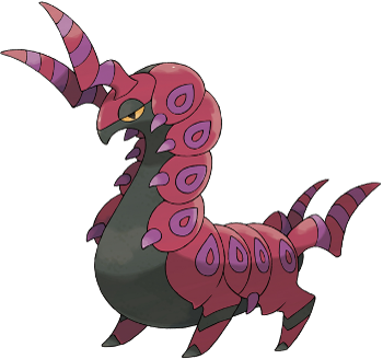
Okay, great, another good-looking mon! Well, not good-looking, I mean it's a centipede, so it is pretty much hideous, but it's another badass Bug Pokemon, which we certainly needed. I have to admit I can't comment too well on how the design emulates its inspiration, because researching centipedes made me shudder and my skin crawl, but I can talk about it from a purely aesthetic standpoint! The color scheme is simple and suitably dark, and red and black always go. His large hindlegs that let him stand upright make him look like a centaur or something of the sort, which is a nice touch, and so too are his big twisted horns, which are almost antler-esque. The purple bands on his carapace help break up what would have otherwise been a pretty simple color scheme and purple evokes the idea of poison, which works perfectly with his Bug / Poison typing. Much better!
Yes! What a refreshing change it is to see a three-stage bug evolutionary line that doesn't end in mediocrity. Scolipede does not look like something that you want to mess with. It's often difficult to tell the actual size of Bug Pokemon from their sprites, and you would be forgiven for thinking Scolipede could fit in the palm of your hand, but Scolipede is actually a giant of a Pokemon, standing at two and a half meters tall. Its intimidating color scheme and menacing horns give it a genuinely threatening look that most Bug Pokemon in the past haven't been able to pull off. Impressive physical bulk and bipedal stance seem to make Scolipede almost racehorse-like. It certainly seems more Centaur than centipede. Overall, this is a brilliant design.
This Pokemon didn't make a very good first impression on me, but I've grown to like it over time. This is possibly the first worm-looking Bug Pokemon that isn't a weakling prevo. The red, purple, and black color scheme is a classic and looks exceptionally good on this Pokemon. Its spikes and legs make it look suitably menacing, and it isn't too shabby competitively either. The stance that Scolipede is taking is even reminiscent of the legendary centaur, lending more credence to its coolness.
Scolipede, Scolipede, does whatever a Scolipede does. Scolipede is part centipede, part horse, part dragon, and all awesome. Now this my friends, is an example of amazing design. What's even more amazing, is that such care and classiness were given to the Beedrill or Dustox of the generation: your generic weak insect Poke at the start of the game. To rub salt in the wounds of long-forgotten designs like Ariados, Scolipede is actually reasonably usable competitively, with awesome stats and movepool for a mixed tank / utility role. Scolipede is just very cool, no matter how you look at it. Here comes the Scollipeeeede~!!!
I suppose I'm not the only one when I say that Gamefreak have outdone themselves in terms of our insect (or arachnid, hi Galvantula!) friends this generation. I suppose they didn't have much to improve on, though I always was a fan of Kricketune. Still, Black & White have brought us an array of lovely Bug-types, and Scolipede is no exception! I never thought that a bug could flaunt crimson and magenta so well, but Scolipede pulls if off with aplomb. The horns and tail horns (?) are striped nicely, while the body-plating opts for a petal-like pattern. The menacing yet somewhat nonchalant pose is excellent, and to be quite honest it's the second-best design for a Bug-type I've ever seen! What's the best? Well you'll have to wait and see...
| « Previous Article | Home | Next Article » |