Judge a Pokémon: Honing in on Hoenn
| « Previous Article | Home | Next Article » |
Welcome to Judge-A-Pokémon, where we rip into the worst, and obsess over the best Pokémon designs. This issue we look at the new Kyogre and Groudon Primal formes, as well as Mega Rayquaza. We've added a rating system so that by the end you'll know which of the three Hoenn mascots most deserves to be a mascot. Our panelists are the wise Antemortem, who will be represented by Driblim, the charming Danmire, who will be represented by Houndoom, the stunning Aurora, who will be represented by Petilil, and the blinding skylight, who will be represented by Emboar.
Welcome back to Hoenn.
Primal Groudon


Sometimes minimal is better, but Primal Groudon's design is so minimal that you have to wonder whether any real effort went into it. Surely this design is brand new and inspired, never before seen t- Oh wait, we have seen this before! Remember that monstrous creation featured in Jirachi: Wishmaker? That's basically what we've got before us, with a more appropriately colored highlight, to represent the lava flowing through Primal Groudon's body, and a larger tail. That's where the creativity ends, though, because Primal Groudon has very little else to offer in terms of its design. I've always loved Groudon, and I was hoping that this would be a chance to give it something really interesting as far as appearance, but Game Freak has fallen short. One must be left wondering if there was much of an effort put into the design here. 2.5/5.

Going to have to hand Game Freak the towel on this. When I first heard about the Primal Evolutions being a sort of backwards Mega Evolution, I expected Groudon and Kyogre to look like something more giant and powerful. Maybe with plates of armor, representing a time when these behemoths were unstoppable. But to have them basically plugged into a wall socket and become a light show? A few of the spikes from the side of Primal Groudon's body and tail do seem more prominent, which makes him a little intimidating, but I am not impressed in any way, shape, or form. What could have been an amazing idea for such a destructive force being the creator of continents itself, has been thrown away. Nothing much to say about Primal Groudon except disappointment, but I will give it a 2/5 for the prominent spikes.

This is pretty unoriginal. You would think something as epic-sounding as 'Primal Reversion' would at least give Groudon its own miniature volcanoes as arms. Instead, all that it's done is make Groudon look as if it's come down with some severe skin condition and transform it into a Western Sydney Wanderers' mascot. It has also decided to apply the definition of 'primal' literally and lower its intelligence to the point that its mouth is permanently agape which, thanks to the lava in the back of its mouth, makes Primal Groudon an apt moth attractant - — I'd love one if it could get rid of my plague of pantry moths! The omegas on its arm are a pretty nice touch, though; a bit gimmicky, sure, but I'm not expecting anything more for the cover Pokémon of a game called OMEGA Ruby. All in all, I'm not too impressed with Game Freak here. Very lazy on their part. They could have done more. 2/5.

Back in the Ruby and Sapphire days, Groudon looked like it didn't really give a fuck about anything. While that works for Slaking, that doesn't exactly suit the terrifying mascot that Groudon is supposed to be. This year, Primal formes were released, and Groudon finally lives up to what it was meant to be. It's finally the terrifying face of Hoenn, the king of the weather war. You could almost say it looks like a Smogoner at Halloween; more than just a little overweight and kind of scary without even needing a costume, which is certainly a good thing. The new and improved Groudon now sports glowing magma, which is hot, both literally and figuratively. Groudon legitimately looks like a force to be reckoned with now. With that said, it's not perfect; it still has flaws that the Primal forme didn't come anywhere near fixing, but at least it looks worthy of being a mascot now. 3/5.
Primal Kyogre

Kyogre's always been an absolute beauty. Its design screams "King of the Sea" to me, and Primal Kyogre's design does nothing but amplify Kyogre's decorum. While one could argue that the differences between Kyogre and Primal Kyogre are as insignificant as the transition from Groudon to Primal Groudon, there's just something about Primal Kyogre that radiates superiority. Primal Kyogre receives a new coating of color - something of a royal blue - and the spot on its head now glows a blinding yellow that gives it the resemblance of an eye. This eye pattern, if nothing else, makes Primal Kyogre more intimidating than ever, giving Mantyke a run for its money in ruse tactics. Overall, Primal Kyogre's got some good things going for it, especially compared to its volcanic Primal brother. 4/5.
Again, neon light show. Primal Kyogre suffers the same fate as Primal Groudon. It's boring, it's got nothing going on for it except for a trip to the paint shop. To be fair, the sleeker appearance does look swifter and speedier, but it is completely overshadowed by the fact that it is only Kyogre with a little more tattoos. Same thing with Groudon, 2/5 because of one minor detail.
This is what Primal Reversion could have done for Groudon. Pitting Primal Kyogre against Primal Groudon is honestly like comparing a Holden to a Ford. I'm quite impressed. Just look at the difference in form. Primal Kyogre's new, more streamlined body and improved rear fins make it look much more aerodynamic than Kyogre ever was, and more intimidating than dopey, hunched-over Primal Groudon. Artistically, Primal Kyogre's new shade of blue makes it look less like the product of a child's coloring book and more 'elegant', which contrasts well with its new pale yellow highlights. It's a significant improvement on the unsettling red-on-blue scheme that Kyogre sported before. I really like Primal Kyogre and it'll probably be the deciding factor in my eventual choice of which ORAS game I get first. 4.5/5.
Kyogre is beautiful. Kyogre is stunning. Kyogre is flawless. That's what I would be saying if I were one of the million Kyogre fans, who spout as much crap as Kyogre can spout water in an Ubers battle. Okay, maybe Kyogre does fare a bit better than that in battle, but the point remains: Kyogre never really was anything special. Red, green, white, no body features that really stand out (whoever thought red could stand out on blue is clearly a genius). The Primal forme of Kyogre fixes all of those problems and more. It now has a beautiful design, a flawless color scheme, it now looks almost weightless, and I dare say it looks legitimately terrifying to come across while diving. There's not much you can fault with this design... I guess I've been converted. Kyogre is life. 5/5.
Mega Rayquaza
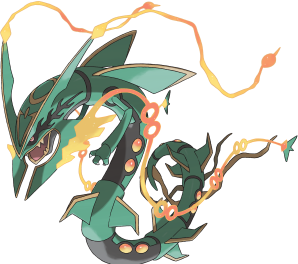
Mega Rayquaza can be summed up as a cool ass dragon, and that's about the end of it. It's one of the neatest, more intricate Mega Evolution designs so far, choosing to improve upon the Pokémon as opposed to giving it a Mega for no particular reason and even downplaying its design. Mega Rayquaza's whole head becomes more aerodynamic and receives fin-like appendages, some of which have long, flowing orange extensions. Who knows what these are? They're freaking cool! It's also got small orange orbs on its body for some reason. Who knows why? They're freaking cool! Maybe Mega Rayquaza's orange theme is meant to represent a blue and red combination, as Rayquaza is meant to be the mediator of its Primal children. Either way, it's freaking cool. 4.5/5.
Now this isn't a Primal Evolution, so we can't really see what Rayquaza may have looked like in the past, but this Mega Evolution takes the cake for one of the coolest Mega Evolution designs, at least for me. What looks to be homage for Chinese and Japanese dragon designs, this monster appears menacing, especially with its gigantic tusks on each side of its mouth (by the way, how would it eat with that thing in the way?). The black outlines on its body really stand out with all its static movements. The only complaint I'd have about this design would be the orange streams coming from its horns and tusks. They stand out a bit too much, but it's not something I'd lose sleep over. Overall, this design is wicked cool. 4.5/5
For the most part, I really like Mega Rayquaza. Unfortunately, those orange blobs that now feature on Mega Rayquaza's skin make it seem as if it too has come down with a skin condition. Happily, those blobs are its only shortcoming. Its new fins give it a more menacing, even somewhat regal, look, and those orange jets of energy shooting from its face makes Mega Rayquaza look quite strong — fitting for the legendary trio leader. Like Primal Kyogre, Game Freak's nailed colors again with Mega Rayquaza: the black-green-orange color combination really gels, even if some of the orange does carry connotations of a skin condition. There's a sense of nostalgia for me when looking at this: it sort of reminds me of some of my SPORE creations from years back, where I'd slap fin-like body parts everywhere to make my creation look a bit meaner. I must have been onto something. All up, I'm pretty happy with Mega Rayquaza. It looks really good, aside from its unfortunate skin condition, and nails the 'badass dragon' design with aplomb. 4/5.
Mega Rayquaza is nightmare material. The cool thing is that I haven't actually had a nightmare about it yet, but given that I have to stare at it in order to write about its design, I'm pretty sure it'll find a way into my nightmares tonight. There's nothing about this Mega Evolution that isn't terrifying. A good majority of people are scared of snake-like creatures. Rayquaza, before its Mega Evolution, looked a lot like a snake but I found it creepy rather than scary. This time around it has a a pink eye, surrounded by these stripes that look a lot like shark fins. Yes, they're trying to combine a fear of sharks with a fear of snakes, and apparently that's child friendly? I'm not even a child and I want to look away. I think I've finally found a Mega Evolution that I wish I could erase from existence for a reason other than being ugly. Save me Arceus. I rate it scary/5.
| « Previous Article | Home | Next Article » |