yeah, it instead looks like it tripped and is in the process of falling over, which is not a good mental image at all to be givenye but at least it feels like it's moving instead of dying.

-
Welcome to Smogon! Take a moment to read the Introduction to Smogon for a run-down on everything Smogon, and make sure you take some time to read the global rules.
-
Congrats to the winners of the 2023 Smog Awards!
Pokemon designs that were ruined by 3D models
- Thread starter Chestnutty
- Start date


I just realized I haven't made my usual Golem rant in this thread. I'll try to be brief, since I've talked about it before in other threads:
The problem with Golem is how the "rules" of how it could be drawn in 2D were flexible, to say the least. Its head and limbs could be placed around its rocky core so they would look good from the perspective of the drawing. It was not possible to "turn the camera" and see it from other angles, from which it would look pretty ridiculous. With all the limbs clustered on the other side of the core, Golem would usually look like a rocky football from any angles but the intended one.
Cue the change to 3D models, where limbs are fixed to the core in static positions. Hence, the designers can't make the necessary adjustments to make Golem look passable from an intended viewing angle, and we go from this:


(Note the position of the head in relation to the arms - it is notably different between front and back sprites)
To this:


Also, sprites allowed for a much greater amount of details on the rocky core. In the 3D model, it is obvious that the core is a single, textured solid object, as opposed to a cluster of rocks.
If anything Golem looks too much like a football compared to earlier gens, going by how the "rocks" are distributed.I just realized I haven't made my usual Golem rant in this thread. I'll try to be brief, since I've talked about it before in other threads:
The problem with Golem is how the "rules" of how it could be drawn in 2D were flexible, to say the least. Its head and limbs could be placed around its rocky core so they would look good from the perspective of the drawing. It was not possible to "turn the camera" and see it from other angles, from which it would look pretty ridiculous. With all the limbs clustered on the other side of the core, Golem would usually look like a rocky football from any angles but the intended one.
Cue the change to 3D models, where limbs are fixed to the core in static positions. Hence, the designers can't make the necessary adjustments to make Golem look passable from an intended viewing angle, and we go from this:
(Note the position of the head in relation to the arms - it is notably different between front and back sprites)
To this:
Also, sprites allowed for a much greater amount of details on the rocky core. In the 3D model, it is obvious that the core is a single, textured solid object, as opposed to a cluster of rocks.

this is just making me realize golem's design is weird and the more i look at any given sprite/model the more off it looks.I just realized I haven't made my usual Golem rant in this thread. I'll try to be brief, since I've talked about it before in other threads:
The problem with Golem is how the "rules" of how it could be drawn in 2D were flexible, to say the least. Its head and limbs could be placed around its rocky core so they would look good from the perspective of the drawing. It was not possible to "turn the camera" and see it from other angles, from which it would look pretty ridiculous. With all the limbs clustered on the other side of the core, Golem would usually look like a rocky football from any angles but the intended one.
Cue the change to 3D models, where limbs are fixed to the core in static positions. Hence, the designers can't make the necessary adjustments to make Golem look passable from an intended viewing angle, and we go from this:
(Note the position of the head in relation to the arms - it is notably different between front and back sprites)
To this:
Also, sprites allowed for a much greater amount of details on the rocky core. In the 3D model, it is obvious that the core is a single, textured solid object, as opposed to a cluster of rocks.
but yeah this is a good example of sort of waht i said earlier: it's pretty clear that a lot of pokemon weren't designed with 3d in mind. So they can make the transition (and many have, since stadium) but always look a bit...off....
The problems with Golem's model have been known since the 1970s
now Golem inspiration appears to be the Ultra monster Takkong

with a few elements borrowed from the later monster Jurass Don

now you'd think that moving around in costume like that would impede your movement for fight scenes
(for the record Jugrass Don grew a second head on top and fought in a more traditional shooting-lasers-from-both-mouths way)
you'd be right; now for those who don't wanna watch a minute and a half video just know that the whole fight between Ultraman and Takkong was obscured by fire and the scenery barring some close ups, people knew the basic design would be next to impossible to show in any way that even resembled a fight (and this is Ultraman Jack, the scenes where super telegraphed even for toku)
and the fact that such a shape is unviable to show fighting is not limited to 3D, even in the anime whenever we see Golem fight it rolls into a ball and tries to roll over the opponent, Golem's body is not made for fighting
the fact that Gamefreak knew of the limitations of the design and went ahead an added it to a monster fighting game really tell us how much of a surprize Pokémon's success was, they probably didn't expect Golem to be animated in 3d or otherwise
now Golem inspiration appears to be the Ultra monster Takkong

with a few elements borrowed from the later monster Jurass Don

now you'd think that moving around in costume like that would impede your movement for fight scenes
you'd be right; now for those who don't wanna watch a minute and a half video just know that the whole fight between Ultraman and Takkong was obscured by fire and the scenery barring some close ups, people knew the basic design would be next to impossible to show in any way that even resembled a fight (and this is Ultraman Jack, the scenes where super telegraphed even for toku)
and the fact that such a shape is unviable to show fighting is not limited to 3D, even in the anime whenever we see Golem fight it rolls into a ball and tries to roll over the opponent, Golem's body is not made for fighting
the fact that Gamefreak knew of the limitations of the design and went ahead an added it to a monster fighting game really tell us how much of a surprize Pokémon's success was, they probably didn't expect Golem to be animated in 3d or otherwise
Last edited:
A lot of talk goes into Pokemon who lost detail when going to 3D, but let me remind you adding detail could be just as bad:


(Overall the models are fine, I just have questions about aspects of the animations...)


(Overall the models are fine, I just have questions about aspects of the animations...)
welp, dying is way worse.yeah, it instead looks like it tripped and is in the process of falling over, which is not a good mental image at all to be given
It still moves a bit, and there's plenty of liveliness in its attacking animations. It's just no longer covered in olive oil and sliding aroundwelp, dying is way worse.
What are you even talking about? scizor doesn't look like that at all in 3D, and it's better then the ridiculous bouncing back and forth it's gen 5 sprite didwelp, dying is way worse.
Like, i don't get your bltant exaggeration that doesn't even make sense

Honestly, the only thing I'd really do for Scizor's model would be to speed up the fluttering of its wings a bit to try and give more of the impression that it uses them to keep itself cool. Y'know, like what its Pokedex entries say it uses its wings for.
That's your opinion. The thing is, I'm not here to convince you or try to change your subjective approach on this matter. Scizor 3D model is, to me, horrible. How horrible? It looks (to me again) like it's dying from some strange and painful disease. I don't remember using it's fifth Gen sprite nor saying anything about that, so I don't know what are you talking about. But! If I were about to tell you I love it's 5 sprite, the hilarious thing is you can't do nothing about that. If my comparison felt exagerate to you, what can I do. At the end of the day it doesn't change the fact that I don't like it's 3D model. Not even a bit.What are you even talking about? scizor doesn't look like that at all in 3D, and it's better then the ridiculous bouncing back and forth it's gen 5 sprite did
Like, i don't get your bltant exaggeration that doesn't even make sense


That's not really the fault of the model so much as Togekiss itself being weirdly shaped. Still better than its Togetic phase... (also keep in mind that Togekiss' model is almost straight on as opposed to the sprite which is much more in profile)

Togekiss's 3d sprite really annoys me, from the coloration to the lack of red and blue triangles/curvature on its wings. Not to mention its poorly shaped and the back sprite looks awful
The bad shape is just a problem overall for Togekiss. It certainly does not look like something that could be able to stay on the ground and keep its balance. Same with the wings. That's how it looks. It merely looks like it's flapping its wings pre-XY, which doesn't really make sense given it looks like a plane.
Togekiss's 3d sprite really annoys me, from the coloration to the lack of red and blue triangles/curvature on its wings. Not to mention its poorly shaped and the back sprite looks awful
The color... I agree with it but it's not something that is restricted to Togekiss.
On the other issues...


It does seem to have lost some triangles in the transition to 3D.
Togekiss I think is an example of Pokemon who's design was made with 2D in mind. It's sprite isn't facing you head on, rather it looks to be taking flight parallel to you. Now for a 2D sprite this works, as long as the sprite is in front of you and isn't looking backwards (not to mention that it would be looking in the general direction of your Pokemon in the 2D games) you understand you're battling it. Thus they can position it so you can see most of its design: the exact shape of its head & body, the design on its belly and wings, even its tail. But the 3D sprite loses a lot of that now that it has to be facing you direct on. The head and body looks smooshed together, can hardly see the designs of the belly and wings, and and only from the back can you see the tail.
Sadly I can't think of a way to fix it, at best maybe having it do an idle animation where it does a small sideways 8 in the air, enough that you can see it from the side and below.
Though just in general Togekiss isn't high on my list of good designs. I sort of see where they were going, egg + bird, but the thing is had it been a straight evolution from Togepi it would make sense. But it's not, it's an evolution of Togetic, who had become fairy-like (it went from handing a pair of hands and wings to just a pair of wings). If anything, Togekiss looks like the middle evolution. I'd more imagine a Togetic evolution would become, I don't know, into maybe an angel-like creature?

Replying to all ya stuff! (S1E2)
Zekrom: Constant, blue light would be awesome on 3D, but I'm fine with what we've got.
Scizor: I like all of his sprites/models. Maybe he's not as dynamic as it used to, but do we realy want him to constatly wave his claws? I don't.
Rhyperior: I just wish they could give back his original, darker coloring.
Golem: His desing is pretty bad, but if he'd get recoloring and new animation, I'd like him a lot more.
Togetic: Never realy liked him and now I realize it's because of 3D.
Mr.Mime: THE. BEST. ANIMATION. EVER. It's sad how it's so unpopular, that people still send out Dark types on him.
Miltank: No opinion for some reason, I'm so neutral to this thing.
UPDATE: If you guys wanna talk only about 3D model, can you still put some BW sprites? It's easier to compare 2D and 3D, so I and probably other people could have more to say about your opinion. Thanks for being active here.
Its attack animations actually do a good job of showing off the parts of its body that aren't very visible in the default model.Sadly I can't think of a way to fix it, at best maybe having it do an idle animation where it does a small sideways 8 in the air, enough that you can see it from the side and below.
I've said it before, but it's a little unfair to judge the 3D models from the default idle animation alone, there's a lot of detail in the attack animations.

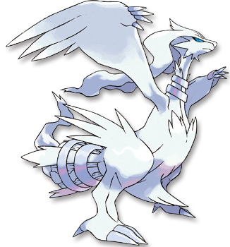
Where was this thread all my life? ive been looking for a place to vent my frustrations on Gen 6 / 7's models and how incredibly BORING they are. The attack animations do a semi-good job of making up for this but the idle animation is a huge part of a Pokemon's overall "battle model" or whatever the term is. Some of the bigger offenders imo like Scizor and Zekrom have already been brought up, so ill mention some other ones like Reshiram:
 &
&

 &
&

It's tail doesn't light up with the cool orange / purple flames, and those yellow rings are now a shiny exclusive instead of being on both forms. Also the white color is a lot more dull. Definitely not as bad as Zekrom but still bad imo
 vs
vs

Torn-T is probably my favorite Gen 6 model but its still a downgrade. Just look how majestic the left sprite is, spreading its wings out occasionally. Now it looks like a regular bird. Also I prefered the darker colors on the sprite (they're both shiny)
 vs
vs

What is this nonsense. It's a spinning top Pokemon that stands on its two feet and does a stupid dance rather than spin on its top like it used to. A pretty unique and fun quirk about this otherwise ordinary Pokemon removed. :( (Spinning for one of its attack animations doesn't count)
There's a lot of other mons with really static + boring models in Gen 6, if there's any other good example i'll post it later
It's tail doesn't light up with the cool orange / purple flames, and those yellow rings are now a shiny exclusive instead of being on both forms. Also the white color is a lot more dull. Definitely not as bad as Zekrom but still bad imo
Torn-T is probably my favorite Gen 6 model but its still a downgrade. Just look how majestic the left sprite is, spreading its wings out occasionally. Now it looks like a regular bird. Also I prefered the darker colors on the sprite (they're both shiny)
What is this nonsense. It's a spinning top Pokemon that stands on its two feet and does a stupid dance rather than spin on its top like it used to. A pretty unique and fun quirk about this otherwise ordinary Pokemon removed. :( (Spinning for one of its attack animations doesn't count)
There's a lot of other mons with really static + boring models in Gen 6, if there's any other good example i'll post it later
Last edited:
blame the animevs
What is this nonsense. It's a spinning top Pokemon that stands on its two feet and does a stupid dance rather than spin on its top like it used to. A pretty unique and fun quirk about this otherwise ordinary Pokemon removed. :( (Spinning for one of its attack animations doesn't count)

see also

Reshiram doesn't even look like a Fire type to me, expecialy with the 3D modelWhere was this thread all my life? ive been looking for a place to vent my frustrations on Gen 6 / 7's models and how incredibly BORING they are. The attack animations do a semi-good job of making up for this but the idle animation is a huge part of a Pokemon's overall "battle model" or whatever the term is. Some of the bigger offenders imo like Scizor and Zekrom have already been brought up, so ill mention some other ones like Reshiram:
&
&
It's tail doesn't light up with the cool orange / purple flames, and those yellow rings are now a shiny exclusive instead of being on both forms. Also the white color is a lot more dull. Definitely not as bad as Zekrom but still bad imo
vs
Torn-T is probably my favorite Gen 6 model but its still a downgrade. Just look how majestic the left sprite is, spreading its wings out occasionally. Now it looks like a regular bird. Also I prefered the darker colors on the sprite (they're both shiny)
vs
What is this nonsense. It's a spinning top Pokemon that stands on its two feet and does a stupid dance rather than spin on its top like it used to. A pretty unique and fun quirk about this otherwise ordinary Pokemon removed. :( (Spinning for one of its attack animations doesn't count)
There's a lot of other mons with really static + boring models in Gen 6, if there's any other good example i'll post it later
I didn't know the Tornadous-T's 2D sprite. Now I like his a lot more. Man, these little things can seriously change your opinion on a Pokemon
I hate Hitmontop in every possible way. He got replaced by a way cooler spinning, possible Fairy-Fighting Pokemon:

His anime voice sounds like a Mickey Mouse and it's 2D and 3D... NOTHING IS RIGHT WITH HIM. 3D is just dancing... We can make a type out of this. And 2D his maybe spinning, but I can't imagine anyone fighting like that.
Last edited:

Actually, the golden rings have always been a shiny exclusive. Even the official artwork doesn't have golden rings.Where was this thread all my life? ive been looking for a place to vent my frustrations on Gen 6 / 7's models and how incredibly BORING they are. The attack animations do a semi-good job of making up for this but the idle animation is a huge part of a Pokemon's overall "battle model" or whatever the term is. Some of the bigger offenders imo like Scizor and Zekrom have already been brought up, so ill mention some other ones like Reshiram:
&
&
It's tail doesn't light up with the cool orange / purple flames, and those yellow rings are now a shiny exclusive instead of being on both forms. Also the white color is a lot more dull. Definitely not as bad as Zekrom but still bad imo
However, I agree that the lack of light in both Zekrom, Reshiram and the two fused Kyurems is quite sad. Does anyone knows if their "mid-battle" animations have their tails lighting up? Those animations tend to be more expressive, even if they apparently can't be ripped as easily as the idle stances... :c
Oh lord thank you for posting Purrloin because we need to talk about that bipedal nonsenseblame the anime

see also


I do not understand why this became the standard purrloin design the moment BW1 came out. Because it wasn't just the anime that did this, the first pokemon cards for purrloin did it, its like this in adventures and I think at least one spin off.
The model itself is fine I guess, and as a design it does go to 3D pretty well, but whyyyy
Hitmontop's new idle animation is at least partially based off its name sake, capoeria

the top spinning is obviously more iconic, but I think going off its inspiration is a neat idea better represented in 3D Models.
I's because Purrloin is a reference to Doronjo the leader of the Dorombo gang, the villains from Yatterman
I do not understand why this became the standard purrloin design the moment BW1 came out. Because it wasn't just the anime that did this, the first pokemon cards for purrloin did it, its like this in adventures and I think at least one spin off.
The model itself is fine I guess, and as a design it does go to 3D pretty well, but whyyyy
incidentally it's not just famous in japan, it's pretty much a template, the Team Rocket from the anime are a standard Dorombo-style characters
not only that, Purrloin also references Leopard (get it?) Doronjo's daughter and successor from Yatterman Night (notice that Leopard might also reference Purrloin itself since while the similarities between both are more obvious Purrloin predates Leopard, then again the point may be moot since both are references to the same character)
Last edited:
So actually Gamefreak finally being able to show the other part of the inspiration for Hitmontop (being based on capoeria, not a "stupid dance" as you called it") due to shifting to 3D, now renders Hitmontop nonsense and boring? Hell, it's Japanese, French, and German name even references capoeria, which you can easily see if you looked at the names on Bulbapedia, and there, it even also references capoeria. If anything, it's more faithful to it's design based on it's Japanese, French, and German name alonevs
What is this nonsense. It's a spinning top Pokemon that stands on its two feet and does a stupid dance rather than spin on its top like it used to. A pretty unique and fun quirk about this otherwise ordinary Pokemon removed. :( (Spinning for one of its attack animations doesn't count)
There's a lot of other mons with really static + boring models in Gen 6, if there's any other good example i'll post it later
Honestly, with both Purrloin and Hitmontop, it feels like people aren't actually looking up anything to figure out why the 3D models are the way they are, and instead cry out "OMG, ruined and awful and shit now!!!"