CAP 10 CAP 10 - Part 7 - Art Poll 3

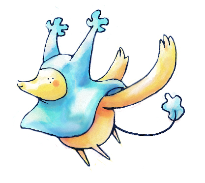
Which design would you prefer for CAP 10?


  • Total voters
    407
  • Poll closed .
Status
Not open for further replies.
I LOVE CAP ART!

reachzero said:
Name: Utility Counter
General Description: This Pokemon is capable of being customized to counter virtually any specific Pokemon, but is incapable of countering a large number of Pokemon at the same time.
Justification: It is not unusual for people to say that "versatility is broken" from an offensive standpoint; less attention is given to versatile defensive Pokemon such as Zapdos or Hariyama. This Pokemon would allow us to study the impact of having a Pokemon that is capable of dealing with such varied threats as Salamence, Lucario, and Gengar....but not all at once.
Questions To Be Answered:
--How useful is defensive versatility in a metagame with so many different threats to account for?
--Given the existence of a Pokemon that can hard counter only specific major threats, which threats will be prepared for the most?
--How would team building change if certain difficult-to-prepare-for threats became easier to prepare for?
--Which is more useful, a Pokemon that can somewhat handle a wide range of threats, or a Pokemon that can handle a few threats extremely well?
Typing: Water/Electric
Stat Spread: 151/84/73/83/74/105
Primary Ability: Trace
Secondary Ability: Magic Guard

 
as awesome as CyzirVisheen's design is, I can't let myself vote for it. It reminds me too much of an evil Chinchou :P although if the current results are any indication, it's gonna win anyway....
 
I still think nothing else other then Cyzir's, is big enough to sport that huge HP stat. Maybe cartoons...
 
Since Doug's beaver isn't here, I need to go with Aragornbird's shrimp. What's better than a shrimp taking out Salamence, Gyrados, or other huge OU pokemon :) Simple design, and I feel that it looks more like water/electric type than the others. Other artists did awesome as well!
 

tennisace

not quite too old for this, apparently
is a Site Content Manager Alumnusis a Top Social Media Contributor Alumnusis a Community Contributor Alumnusis a Researcher Alumnusis a Top CAP Contributor Alumnusis a Tiering Contributor Alumnusis a Contributor Alumnusis a Smogon Media Contributor Alumnusis an Administrator Alumnus
This is going to be the one and only warning in this thread: if you post support for an artist without saying why you voted for them, your post will be infracted and deleted. This is a public poll, if people want to see who voted for whom then they can simply check themselves.

Anyway, I voted for Cyzir. I felt that his design had the most character out of all of them. I really like how he took a real life animal and put a unique spin on it, while not beating down the concept of Electric/Water.
 
The CAP drawings are always so amazing, so I would like to say "great job" to all of the artists for wonderful designs.

With that being said, I would like to talk about why I voted for CyzirVisheen. I thought that he had the best concept of anyone. It was so original and was very well-executed. I liked how I knew what the concept for the art actually was instead of just looking at the drawing and wondering what it was. While others may not agree, I like pokemon that make sense from a real-world perspective.
 
I personally enjoyed all of these concepts, but my favorite had to go to aragornbird. The design provides a nice balance of realism and originality. I can effectively see that the concept is of both natures electric from its luminescent glow and from its obvious water typing being a shrimp. But mostly i like that it looks more agile then the other submissions, dipping into that 105 base speed. All in all, I enjoyed them all!
 
I voted for cartoons, not only does it look visually amazing, but the way its built also supports a very large variety of attacks that may be needed any movepool we eventually come up with. I agree that Cyzir's and Yilx's are also very great looking, but I feel that the design/body structure will also limit the movepool needed for a utility counter. Now I know that the movepool does not need to match the art design perfectly if at all, but I'm sure many people would agree with having a pokemon whose moves are logical options according to the way the pokemon looks like. Also, I think cartoon's design, along with aragorn's is much more fun and expressive than the other's, I believe that not every pokemon has to look evil, and so far many of the previous CAP's such as Collosoil and Pyroak are mostly "gah, look at me I'm so B.A." I think it's due time for a cuter looking CAP.
 
Still Aragornbird, because it feels like it fits the concept, stat spread, and abilities best.

Cyzir's is great, it's nicely drawn, hugely creative, and pretty endearing.... but I don't see how a thing like that could be as fast or as (potentially) offensively strong as we're making it. =0 To me, it looks more along the lines of Bronzong or Blissey in terms of being mostly wallish, rather than a potential offensive threat as well.

Cartoons', being in the mold of the legendary 'pixie / fairy'-type legends, seems like it fits the stat spread the best. It's very quirkily-creative and endearing as well, and as much as I like it, I personally think there are too many of those fairy things like Mew and Jirachi already.

Yilx's also has the same problem with originality with me. It's one of the (if not THE) most visually pleasing entries to me, but it looks way too much like Mismagius for my taste, plus we've already had a CAP squid. D: That and it looks more sweeper-ish to me, or at least, I don't see it being as bulky as we made the stat spread.
 
i actually decided that cyzir's huge design kinda worked against it in a way. a big advantage of the other three designs is that they look like they would be lightweight, ie. grass knot would have a low base power against them. personally, i'd like grass knot to have a low base power against cap 10, and with that in mind, i decided a vote for cyzir just wasn't economical.

i ended up voting for yilx, but frankly i love all of these designs. <3
 
I voted for Cyzir because his concept easily has the most personality and the design was beautifully rendered. As great a job as Aragornbird did, I still do not think it looks like something that should be used outside of Little Cup. Just a personal reference. And I hate to say it but Cartoons!' eye change hurt him in my opinion. Definitely felt better about the first ones. Yilx put forward a great design but I like things that look a little more 'GameFreak-ish' I guess.
 

reyscarface

is a Tournament Director Alumnusis a Social Media Contributor Alumnusis a Forum Moderator Alumnusis a Community Contributor Alumnusis a Tiering Contributor Alumnusis a Smogon Media Contributor Alumnusis a Dedicated Tournament Host Alumnusis a defending SPL Championdefeated the Smogon Frontier
World Defender
I still think nothing else other then Cyzir's, is big enough to sport that huge HP stat.
Whats your opinion on Vaporeon? Does it look like it can sport that huge HP stat? What about Lanturn?

But mostly i like that it looks more agile then the other submissions, dipping into that 105 base speed.
Because the first thing I think when I see Jumpluff is that it totally seems to be that fast.

I agree that Cyzir's and Yilx's are also very great looking, but I feel that the design/body structure will also limit the movepool needed for a utility counter.
Idk how many times this has been adressed, but the ART HAS NOTHING TO DO WITH WHAT WE DO LATER ON. Wooper and Gastly with punches, Aerodactyl without Brave Bird, etc. This has been said an inmense amount of times but it seems like people just dont get it.

That and it looks more sweeper-ish to me, or at least, I don't see it being as bulky as we made the stat spread.
Vaporeon says hi again, and so does Shaymin (better defensively than even swampert).

Im not trying to call out anyone, im just saying that this "hey this thing has no arms so we wont be able to give it punches therefore i will not vote for it" or "it looks too fat to be fast" / "too tiny to be bulk" kind of stuff has to disappear because if pokemon has taught us anything, is that nothing, or at least a lot of the things in this game, do not make sense.

That being said I voted for Cyzir. My favorite was Doug's because that beaver was seriously bad ass while keeping some tone of cute to it, and I have always loved beavers :B. Sadly Doug didnt advance, therefore my vote went to Cyzir because if theres something his drawing has, is a touch of personality and cuteness that I really have enjoyed since he posted it. Besides its very very original and it always looks happy ^.^!

Edit: Then the evolutions of such pokemons should get the moves, not the preevos. Thats like... saying a guy without arms will start doing professional boxing without his arms because he will get suplements later on... or something... weird example I know but this "evolution" term does not have clear comparisons with the real life really.

Oh and about Aerodactyl, its not about being the complete opposite of what I said, but it was yet another example that things in the "Pokemon World" do not make sense, I know Aerodactyl look like it should get Brave Bird -.-
 

Skymin_Flower

It's Seed Flare time.
Aragornbird's is an amazing design, my favourite after Doug's beaver :( I love Cyzir's, but imo it looks a lot like bronzong... Th shrimp was well thought out, and very well drawn. Great concept.

Also it doesn't look too strong, and generally fits the stat spread well (minus the large HP o.O, but as rey said, look at vaporeon and lanturn.)
 
Idk how many times this has been adressed, but the ART HAS NOTHING TO DO WITH WHAT WE DO LATER ON. Wooper and Gastly with punches, Aerodactyl without Brave Bird, etc. This has been said an inmense amount of times but it seems like people just dont get it.
I do "get it," if you read the very next sentence I do mention that I know that the art doesn't need to fit, but doesn't it make sense that it should? Wooper and Gastly both do not have arms, but their evolutions do, so it actually does have a logical reasoning behind it, unlike if gyrados had mega kick for example. Although an artificial pokemon, we should attempt to make it as real as possible.

Also, aerodactyl not having brave bird is the opposite of what you are trying to say, aerodactyl looks like it could have brave bird but doesn't, not aerodactyl has brave bird and looks like it shouldn't be able to.
 
Im not trying to call out anyone, im just saying that this "hey this thing has no arms so we wont be able to give it punches therefore i will not vote for it" or "it looks too fat to be fast" / "too tiny to be bulk" kind of stuff has to disappear because if pokemon has taught us anything, is that nothing, or at least a lot of the things in this game, do not make sense.
LOL, point well taken, I'm actually glad you pointed that out. Actually, your little tirade sort of addresses my concern of Aragornbird's shrimp not looking like it can support that large HP stat (IMO anyway).

So I think you're right, this IS an important thing to keep in mind, but all the same, I still think Aragornbird's shrimp works the best for this, not only in terms of concept but also in terms of originality.

I guess we'll just have to see how it goes.... I know I'll definitely be fine with any of these four winding up as the final design.
(allllright, not wanting to monopolize the posting space so I'll shut up now. .____.)
 
I wanted to vote for aragornbird, but his name is third on the list, despite the picture of the shrimp being presented second, so I ended up inadvertently voting for Cartoons! instead.
 
I love Yilx's design (the reason I didn't mention it on the other thread is a mystery), but CyzirVisheen's entry is the best concept in this CAP.

...For me, at least.

Hell, it's a reverse angler fish with some kind of sentient lamp, how can I not love it.

But Yilx's creation still manages to be the cutest fan-made Pokémon I've ever seen.
 
I voted for aragornbird's luminescent shrimp design. I love its elegant simplicity, and its originality. That and my girlfriend walked by the computer screen as I was weighing the choices and said it was the cutest thing she's ever seen. While there have been many fish and jellyfish Pokemon, there hasn't been a shrimp. Despite being small, that exoskeleton looks like it can take a beating. And since it's so tiny, grass knot becomes a non-factor. Honestly I just love everything about it. I have nothing negative to say.

While CyzirVisheen's design is impressive artistically, I felt there's a little too much going on at once. And honestly when I first saw it I thought it was just a new evolution of Lanturn. And since there's already an electric/water anglerfish Pokemon, do we really need another? It's beautiful work though.

Cartoons!'s design would be my second choice. I like the watercolor feel, almost something you might see in a Miyazaki movie. But something bothers me about the lack of an eye. It also doesn't feel very water type to me. The animation is a nice touch though.

Yilx's design is very pretty, but simply doesn't feel like Pokemon to me. It looks more like graffiti art. In other words, it's a bit too hip for this purpose.

So for me Aragorn's is the clear winner here.
 
I totally agree with you reyscarface, pokemon has in fact proven to have its fair share of surprises :D.

But I still kind of stand by what I said. Not to use up the space in the thread and make this controversial or anything lol, but to explain myself.

I said what I said because whatever the decision you make whether it be logical or not, is in fact your choice. I love the designs for all of the submissions and wouldn't mind if any particular one won, but my decision ended up boiling down to how practical the design was with the stats and in my own opinion it fit XD.

Again, no disrespect and I'm not trying to be controversial, but thats just why I made my choice =P.
 

SJCrew

Believer, going on a journey...
is a Tiering Contributor Alumnusis a Battle Simulator Moderator Alumnus
Aragornbird

I disagree with Reyscarface entirely. It's not that CAP not having limbs for the elemental punches will prevent it from getting the moves we want, but I still want it to at least look like a Pokemon capable of doing anything, for the sake of my own preference, and I think our little shrimp dude handles that concept beautifully. We have way too many Water types in the game, and on top of that, way too many fish, but I've never seen a shrimp before and I really think this change of pace is a good idea. That is why I will continue to support the concept until it gets in.
 
Cartoons!'s is definitely my favorite. Yilx's and the shrimp both bore me, while Cyzir's just seems...I dunno...overdone. Cartoons!'s is both simple yet creative, cute, and cool. Most importantly, it looks like something that I'd want on my team. I also admire the old Sugimori style, and his .gif won me over before.
 
Going Cartoons! Again. Like before, I feel it fits the spread the best. I imagine it as some sort of good natured sprite who mimics others and is very hard to kill. It doesn't look threatening but I wouldn't want to piss it off either.

Don't forget, the style and quality of the art itself will all be normalized when we put it in the game. If it looks weird or ugly, it might not when we sprite it, it's the concept that matters, I think.
 
I LOVE YOU CARTOONS!! That sea pixie thing is amazing. That supporting material just shows the range of moves that pixie can use, just like those other fairies-things like Clefable and Blissey. And it gonna have magic guard like Clefable and high HP like Blissey too. What a coincidence....

And for originality, i think Cartoons definitely wins too. I woulda had no idea what kinda creature it is if it didn't say so. Definitely super original.
 
I wanted to vote for aragornbird, but his name is third on the list, despite the picture of the shrimp being presented second, so I ended up inadvertently voting for Cartoons! instead.
The ballot was confusing!

I voted aragornbird, because I thought it was awesome since post 3 of the cap10 art submission thread. I also want to say "prwn'd" after a battle. And I envision it's feelers acting like a Jacob's Ladder: http://www.youtube.com/watch?v=5bbf5RnxQ48

As for the connection between HP and design: It totally fits. Underneath that shell, he's all mussel. And anything that could be explained by a bad pun is totally justified. Or, maybe it defies preconception and is actually 50ft tall.

I like all the designs, but ultimately Cyzir's is my least favorite of the final four. It's awesome, but it reminds me of hamster tubes. I see so much potential awesomeness with it, but then I always see a little gerbil running around on the inside and I have to dismiss it.
 
I voted for the doomshrimp. I am dissapointed that Paras Hilton's did not make it. Aragonbird's shrimp is unique yet definitely looks the part. Cartoons! looks like it could be a psychic fairy like mew or the pixies. Cyzir's doesn't look like it will sprite well (while it is good art). Yilx looks like it has MCR on in its pokeball. It's not bad looking, just not much a fan.
 
Status
Not open for further replies.

Users Who Are Viewing This Thread (Users: 1, Guests: 0)

Top