
-
The moderators of this forum can be found in the CAP forum staff directory.
-
Welcome to Smogon! Take a moment to read the Introduction to Smogon for a run-down on everything Smogon, and make sure you take some time to read the global rules.
-
Congrats to the winners of the 2023 Smog Awards!
CAP 29 - Art Submissions
- Thread starter MrDollSteak
- Start date
- Status
- Not open for further replies.


WIP
http://imgur.com/gallery/s4ZoXTd
This creation is quite imaginative. Base on electric eels whose generate electricity by absorbing ionize particles in the water. This CAP absorb the mythical infinite energy generated from the move attacked it and turn that into it own energy/type.
It submerge half of it body into the ground, allowing it to absorb even more energy from the environment, but make it vulnerable to ground type attacks. Thanks to it ability to travel trough even the slightest cracks, it can suprisingly strike the enermies by sneaking it tail to the enermies foot.
This design still need more revisions, so hope you guys love it.


WIP
I'm definitely sure I made an anime character now. >_>
Changelog:
I'm definitely sure I made an anime character now. >_>
Changelog:
- Started outlining.
- Made pompadour bigger due to Coil being added as an optional move.
- Changed shape of teeth to look less humanlike(?). (Thanks, Pipotchi!)
- Changed shape of eyes to look more interesting. (Thanks, Darquezze!)
- Changed hands to look less like literal cartoon white gloves.
- Changed pattern between black and white spots to look like ink splatters. (Thanks, Anacrusis, even if I ended up changing the suggestion entirely! [personal link for reference])
- Added additional "drips" around the arms to resemble that thing on ruffled shirts I don't know the name of.
- Likewise, removed extra "drips" on legs.
- Tweaked shape of lips to look less Goofy.
- Any changes/overhauls that may be required from Defining Moves.
- Color experimentation.
- Shading.

hi there! not sure i have too much to say, but i really like this design! however, i think there are some aspects from the older version that could be carried over. To start, i think the super saturated colors for the colored bits in the first iteration was a really nice touch and made everything feel super vibrant, which feels a bit lacking in this version. Furthermore, i thought the body patterns on the older iteration were really cool and effective since they pushed the sauropod feel, pushed the realism of the glass due to the low-saturation replication of the patterns on the other side, while also filling up the "deadspace" on the body with a dark type cue, and i'd really love for them to return. This is all around really good work though, gj and gl in the polls!!mad scientist gas flask dino pt 2, a little more dark/poisony. Tried to make it less dragon-looking. Looks a bit deranged, but it has a calm mind.
still looking for feedback!! thanks Yokaiju for your suggestions :)
Modpost:
We have just finished the Defining Moves stage of CAP 29, and here are the moves we are considering when submitting stats for it. Required moves are guaranteed to show up in this Pokemon's movepool, so you should take them into account for your designs. Optional moves are not guaranteed to make the final movepool and are dependent on stats that support their addition.
We have just finished the Defining Moves stage of CAP 29, and here are the moves we are considering when submitting stats for it. Required moves are guaranteed to show up in this Pokemon's movepool, so you should take them into account for your designs. Optional moves are not guaranteed to make the final movepool and are dependent on stats that support their addition.
In addition, CAP 29 is likely to be bulky and moderately fast. After Threats Discussion finalizes, we will have Stat Limits and Stat Spread Submissions, which will take around three weeks. Afterwards, you will have 48 hours to make your final submissions. Make sure to keep all of this in mind when creating designs for CAP 29!Required: Calm Mind, Consistent 50% Recovery (Recover and it's clones, alongside Roost), Sludge Bomb, Dark Pulse
Optional: Coil, Strength Sap, Gunk Shot, Knock Off, Scald, Ice Beam
Last edited:
WIP
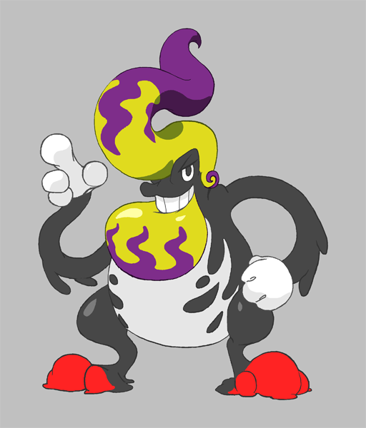
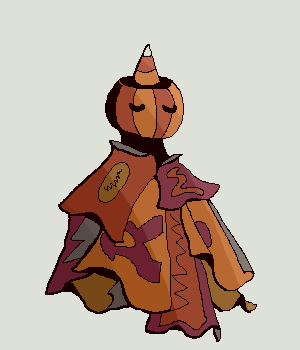
Guess who changed the design again. Now, instead of makeup, it's a pile of candy/candy wrappers! And it's wearing it like a dress! Wooo!
Guess who changed the design again. Now, instead of makeup, it's a pile of candy/candy wrappers! And it's wearing it like a dress! Wooo!
WIP

Okey i finally have a definitive desing, its inspired by Anna's Hummingbird ( Calypte anna), which is quite known for the effect that its feather have to somewhat change colors, and also a Pitohui, a type of bird that have and really powerful poison on its wings, capable of producing burns on the skin.
This pokemon basically dispereces those toxins at high speed by flapping its wings while the form of its beak (inspired by a plague doctor mask) protrects it from having particles enter their eyes or nostrils.
Overall i really like this little dude, i know it doesnt really fit with the concept of a Bulky Sweeper but the concept i think is very solid, and i have to thank Gekokeso for giving me inspiration for this concept a couple weeks back.
WIP
Almost done! Still Keeping this a WIP in case of any other changes needed.
Almost done! Still Keeping this a WIP in case of any other changes needed.
WIP
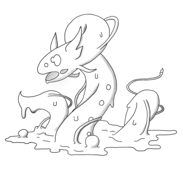
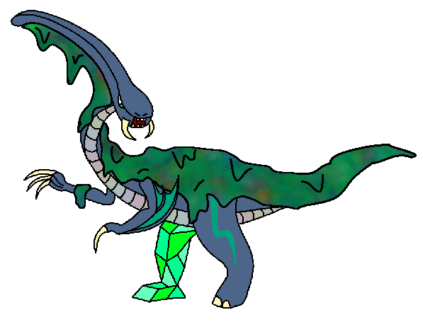
http://imgur.com/gallery/jiS8SWt
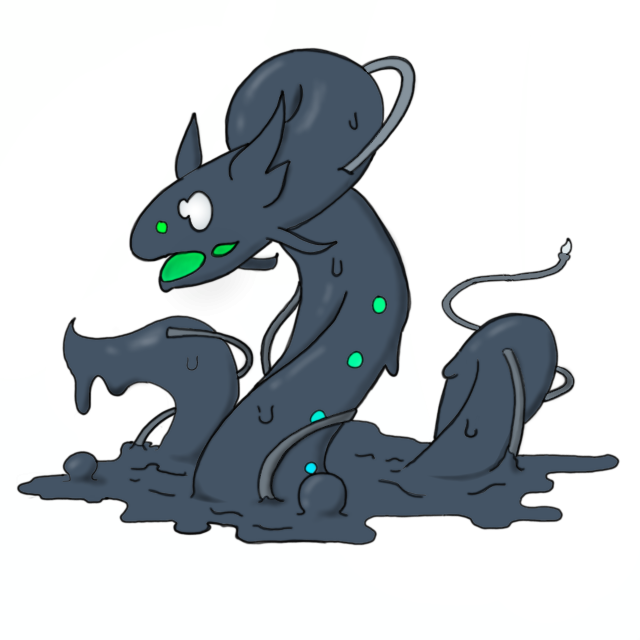
Finally colorized my glup eel, keep in mind that it still can be changed during the process, but overall I say it is mostly finished.
Also supportive art is coming on it way, Wohoo :3
http://imgur.com/gallery/jiS8SWt
Finally colorized my glup eel, keep in mind that it still can be changed during the process, but overall I say it is mostly finished.
Also supportive art is coming on it way, Wohoo :3

Missing Dev 0, I like the design but the eyes/mouth/face colors are so dark it's hard to see the eyes and mouth details. Perhaps one of the colors should be lighter?
DrifblooomCF I love this idea. I'm enamoured with birds (bird-inspired pokemons that aren't flying type like the torchic line stimulate my imagination a lot), and I find this concept to be truly solid. I was convinced that 29 had to be invertebrate-oriented, and yours have opened my mind.
I see two big similarities with another atypical bird line, the Aromatisse line here, since you used the plague doctor mask as a beak in combination with that strong pink colour (which is distinctive of the hummingbird you talk about). I would suggest to develop this combination a bit more so you distance your design from the already existing line, unless you want to link Spritzee to your idea somehow, which would be really cool, but I don't know if it's "legal". I guess it is not problematic to design a pokemon similar to an already existing one, but it's always nice to explore other options.
One of the best aspects of your design is the detail and prominence of the wings, which are essential to understand the "corporeal translation" of the color change ability. As long as you keep this level of focus in wings, I think you can liberate yourself and explore other forms and colours if you desire to. I would play more with dark purple over black in order to avoid a contrast too high, but that's a matter of preference.
In case you want someone to talk about the development of this idea and you ever find me of any help, just sent me a message!

WIP
The candy dress pokemon!
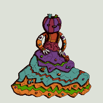
Getting p close to a design I'm happy with, its a VERY small little boy.
The candy dress pokemon!
Getting p close to a design I'm happy with, its a VERY small little boy.
WIP
I think this will do as a final render for this design, though I still do want to explore the snake concept if I have the time.
Supporting material will appear in the coming days.
I think this will do as a final render for this design, though I still do want to explore the snake concept if I have the time.
Supporting material will appear in the coming days.


WIP

pretty happy with how it's looking at this point. i think this is relatively final for now, probably small adjustments from now, and some big ones if the stats look very different. however, at this point, the design reads as very bulky and reasonably fast, so i don't think it's too concerning. still up for more feedback and suggestions! & will find time to make some supporting art as well
it's just my second time submitting art to CAP, but i'm really enjoying the process so far :) thanks to JJslem and especially Zephyr2007 for your insights, and everyone on discord with feedback on the eyes.
the eye options:

B and F were the most popular, but for now I've settled on F because as Quanyails pointed out, spiral eyes might be hard to render clearly on sprites/models. I think it imparts more personality as well, along the lines of madness/sleep deprivation.
Just thought I'd put some thoughts
Cevered- This is a very cute design and it works with color change and typing. This is honestly one of my favorites going into this. Hope you can make a final design for it cause I'd love to see this in the poles. The bubbles idea was masterful and it keeps the design simple, but it's a detail that I thought was nicely added.
Darek851- This one's interesting, it takes Kecleon and changes it completely. I love the spray paint idea and it shows the poison type nicely. the part where it puts them on its back is also really cool. I really think there can be alot that comes from this design.
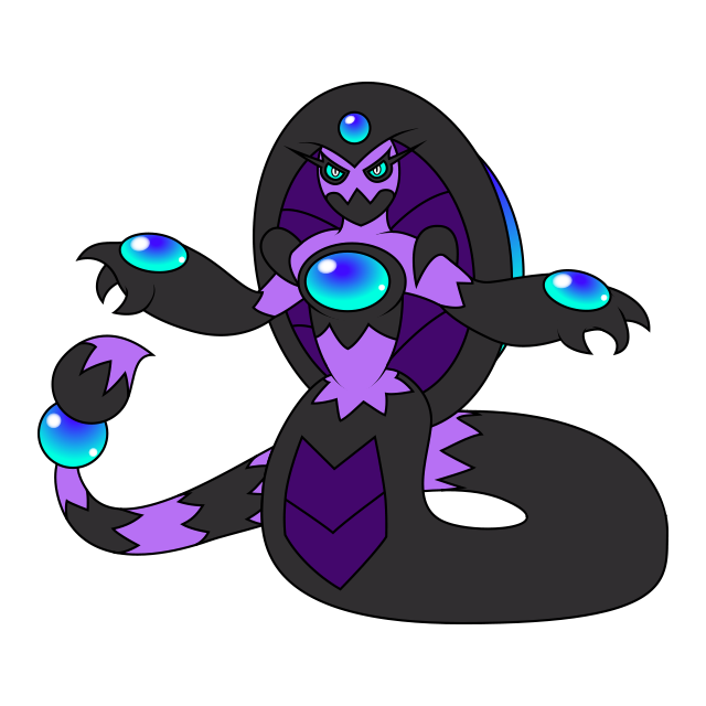
Explosion Badger- This design is banding and I love it. Ik this is based on a cuddle fish but man this looks like Cthulhu. the typing is defiantly there and the color change as well. I'd say this is defiantly getting far in the poles, this one I'd love to see get very far. GJ!
Glacios Ionic- This is a great design for a Dark/Poison-type, even though the color change is there, it is a bit hard to see. a tar snake really is cool and has a lot of potential.
LowenCraft- lel
Magikarpet ride- there already being a lot of octopus and squid creatures may have brought down most designs, but for some reason, yours feels "different" and that's why I really like it. I did like the original, but you said what happened there. the design is great and I would love to see where it can take you!
Mos-Quitoxe- one word, CREATIVE. I love that you made your design completely different from everyone else's. the typing definitely works and the color change is there. I personally think this one is better than the snakes, but they are still really cool! This I really hope gets far in the poles because I really like this design.
The Metric System- this is really cute, no joke. there is poison type, but I can't see dark, I can kinda see color change. I really think that you can make this greater, swapping the darker one with the green one I think would bring out the dark.
Yokaiju- oh boy, where do I begin, this is an awesome design, it looks sick like most of your designs do. I even think you can agree it looks like a dragon type right? But, it's based on an eel so if you look at it long enough it sinks in and you can say it does look like a Dark/Poison type. I love the design and I hope it gets far in the poles as well. when you compare what someone like you made to something I made, let's just say mine can go in the garbage. I hope the dragon-type appearance doesn't drag it down because this should get far.
Z-nogyroP- This is a simple and great design the thought of making an oil painting into CAP 29. I think this is a very good one I can see the Poison/Dark typing and even though the color isn't really that diverse, I can see it having color change. just make one final model for it and it's ready for the poles.
If I didn't speak about yours and you want me to, then just tell me, I only spoke about some of them and ik that there are other ones that I haven't said anything about. If you want me to you know what to do!
Cevered- This is a very cute design and it works with color change and typing. This is honestly one of my favorites going into this. Hope you can make a final design for it cause I'd love to see this in the poles. The bubbles idea was masterful and it keeps the design simple, but it's a detail that I thought was nicely added.
Darek851- This one's interesting, it takes Kecleon and changes it completely. I love the spray paint idea and it shows the poison type nicely. the part where it puts them on its back is also really cool. I really think there can be alot that comes from this design.
Explosion Badger- This design is banding and I love it. Ik this is based on a cuddle fish but man this looks like Cthulhu. the typing is defiantly there and the color change as well. I'd say this is defiantly getting far in the poles, this one I'd love to see get very far. GJ!
Glacios Ionic- This is a great design for a Dark/Poison-type, even though the color change is there, it is a bit hard to see. a tar snake really is cool and has a lot of potential.
LowenCraft- lel
Magikarpet ride- there already being a lot of octopus and squid creatures may have brought down most designs, but for some reason, yours feels "different" and that's why I really like it. I did like the original, but you said what happened there. the design is great and I would love to see where it can take you!
Mos-Quitoxe- one word, CREATIVE. I love that you made your design completely different from everyone else's. the typing definitely works and the color change is there. I personally think this one is better than the snakes, but they are still really cool! This I really hope gets far in the poles because I really like this design.
The Metric System- this is really cute, no joke. there is poison type, but I can't see dark, I can kinda see color change. I really think that you can make this greater, swapping the darker one with the green one I think would bring out the dark.
Yokaiju- oh boy, where do I begin, this is an awesome design, it looks sick like most of your designs do. I even think you can agree it looks like a dragon type right? But, it's based on an eel so if you look at it long enough it sinks in and you can say it does look like a Dark/Poison type. I love the design and I hope it gets far in the poles as well. when you compare what someone like you made to something I made, let's just say mine can go in the garbage. I hope the dragon-type appearance doesn't drag it down because this should get far.
Z-nogyroP- This is a simple and great design the thought of making an oil painting into CAP 29. I think this is a very good one I can see the Poison/Dark typing and even though the color isn't really that diverse, I can see it having color change. just make one final model for it and it's ready for the poles.
If I didn't speak about yours and you want me to, then just tell me, I only spoke about some of them and ik that there are other ones that I haven't said anything about. If you want me to you know what to do!
WIP

A new version of the hummingbird, changed the colors to better fit the real bird while also separating it from the aromatisse line a bit.
Also i added green feathers on the body, kinda looking like the colorful reflections on the feathers of real hummingbirds, plus a lot of spec on the wings that represent the way it disperces its poison, kinda like powders.
Supportive Material:
A group of recolors in 96x96 size, similar to how arceus changes colors (i know, thats not how Color Change works but its just for fun)
Some biology, reference of its back and size
(Also a detail i didnt mention before, the whole form of the head is a reference to thus REAL plague doctor mask that are made of leather and cover the whole head)
Some feedback for users that arent on the discord or I havent responded to yet:
DrifblooomCF This is a very interesting concept, but some things I'd heavily consider with this idea is that there is a very large focus on the wings and bird aspects, which push the design out of the poison/dark typing. Normally, I would usually feel okay if a mon looks multiple types as long as it can encapsulate the types we need, but it's very hard to not see this as part flying, which evidently knocks one of the other two required types off the table. Additionally, the heavy use of pink doesn't feel like it's enough to invoke a poison typing, despite the plague doctor motif that I think is there. I would definitely suggest reevaluating the design elements you want to focus on in this design so that it pushes the typing in a more understandable way.
JAGFL I love designs that use primarily white, and I think the colors you chose here show off the typing in a very different and fun way. I think the only thing that might need to be looked into is that pokemon that were based off of mushrooms are grass types, with the two poison-type mushrooms being part grass as well. From a first glance, it's a bit hard to see this design being dark type, and if anything, the colors paired with the mushroom concept seems to push a fairy and grass typing instead, similar to that of shiinotic and morelull. If mushrooms are your concept that you want to keep, I think emphasizing the darker elements of the design may push the dark typing out more.
JJslem This is a fun and goofy design, but my first impression of it is that im sort of confused as to what exactly it is. It's important to remember that the people voting on your design will most likely not take the time to look through whatever description or explanation you have of it, so it's vital to make your design understandable at a glance. Whatever this is based off of, it would be nice to see you flesh this out a lot more and create more understandable elements to draw the viewers' eyes around. Right now I see that there are tentacles, so maybe making it resemble more of an octopus or squid will help in that aspect.
Magikarpet ride A very simple but nice design that is easily readable. I think the only thing you should work on is making a pose that looks more interesting, and maybe making the main body larger as to create a better point of interest for the viewers. Playing around with some sort of pattern on the main body instead of random dots will also create a much stronger identity for the design, since as of now it doesn't seem to really make me feel strongly for it.
Magmajudis Cool snake, only thing I think this design needs to do is use a slightly brighter set of colors so the colors can be better read, and to reduce the amount of colors on the belly. Less is more in this case, so creating a pattern of 3 or so colors really helps the design look more organic.
SunMYSER I am immediately attached to anything with a mohawk/afro. This design is really cool, but it feels very detailed in the folds on its back and the small details that are everywhere on its body. Removing many of the folds and limiting the number of spikes that run down its head to its back legs would create a better focal to look at. It's a situation where having less spikes creates more identity to each individual spike, while having too many like you do now makes it feel too cluttery and makes eyes pass over it.
The Metric System A very fun design, and probably the most different takes of the typing and ability ive seen yet. I can't really comment much on this without destroying the idea you have going for it, so the only thing id really like to say is that i think the hat on the green one could look more unique, so that it pushes the design into becoming more interesting. It doesn't have to be a grandiose change, but something that says a little more than just "a hat".
The Unseen Potato I actually had to read the description for this one because I didn't actually understand what this was. Similar to my advice for JJslem, I think this design should have more understandable design elements to it so the viewer can tell at a glance what it's about. Not to say it's a bad design, but it's good to keep in mind that your voters will most likely vote based on their first impression of the look, and if you have to explain what it is to them, they'll most likely miss that explanation. Another thing about the design is that there don't seem to be a lot of points of interest for the viewer to look at, besides the pipe hat, which ends up making the design feel a bit too simple and uninspired. I believe if you added strange shapes to it, similar to that of what you did for the face, it would then at least push that aspect better. You mentioned that it was some form of escaped blob, so it would be kind of interesting if you pushed that into the design as well.
flying moose I saw you talk about this concept in the discord I think, and it's a very fun concept to work with. The shapes on the back are what I think makes this design look very fun, but the main body itself feels a bit too simple compared to them. It would be interesting to see the main body have more of a form to it.
sgtxam This is concept I had a hard time understanding, so I'm just going to give feedback on the design itself. I think the head is a bit far too large and oddly angular compared to the rest of the body, and what I believe is smoke on the head is hard to read in its current form. Additionally, the head being so large creates a large focal point at its head, but it also being black and monotone makes it push that focal away from it. This kind of creates a bit of a jarring look since it looks like it's supposed to be the "cool" part of the design, but it ends up going to the body instead. For what I believe is the smoke, I think making the wiggly lines more shaped instead of conforming to the contours of the head will make the head far more interesting to look at. The camo on the body is a very nice touch though, and is one of the few times i appreciate designs with many colors on it.
Advice for everyone here in general: Please feel free to ask for feedback on the Discord server! Everyone can only say so much in a forum post, so seeing a live update of feedback from a lot more people tends to help much better, for you and your feedbackers :)

Slapperfish
Banned deucer.
WIP
A long-overdue update on my naga design. I changed the shape of the facial features, relocated the ponytail to the tip of the tail, and moved the zigzag pattern on the tail a bit farther up so you can see where the transition from solid color starts.
Now that I'm happily content with how the design turned out, I think I'll start working on some supporting material in the meantime before I start shading it!
Final Submission
Doesn't really work with the direction CAP29 has gone, but I havn't gotten any new inspiration, so I'm just gonna submit it as is.

Doesn't really work with the direction CAP29 has gone, but I havn't gotten any new inspiration, so I'm just gonna submit it as is.
WIP
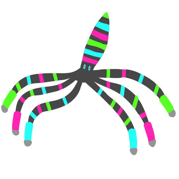
Based on suggestions, I rejected new octopus, returned to Punke. Yes, the old design is back! Still working on a good pose though. Any feedback would be essential!
Based on suggestions, I rejected new octopus, returned to Punke. Yes, the old design is back! Still working on a good pose though. Any feedback would be essential!
I would heavily recommend adding a black outline so that you can have your tentacles overlap each other, which can help you make a better pose. This might also help parts of the design become more obvious, such as the spray cans on the ends of the tentacle. After that, I would focus on shading and perspective, but for now, you should focus on adding that black outline to your mon.WIP
View attachment 321948
Based on suggestions, I rejected new octopus, returned to Punke. Yes, the old design is back! Still working on a good pose though. Any feedback would be essential!
Oh boy. My 2nd fav part of the CAP process.
Now that I have some time, been looking at some designs. And liking a lot of what I see.
But here are some thoughts/shoutouts I have:
Note: Please take what I say with a grain of salt. I suck at drawing and art.
Darek851: Has a hyper urban aesthetic to it like in. The black base is a great canvas for the cyan, neon green, and purple that grab my attention. some of those colors I also associate with poison.
+ Radio waves for eye balls to fit with the headphones? And spray paint cans for fins?
DougJustDoug: I like the base design but really needs colors to make it pop. I know its a WIP. + those coins it has look like gym badges.
Maybe use actual gym badge designs?
Explosion Badger: The rainbow coloring really sticks out to me but the rest of the color choice feels a bit muted. Maybe try and use the rainbow color a bit more?
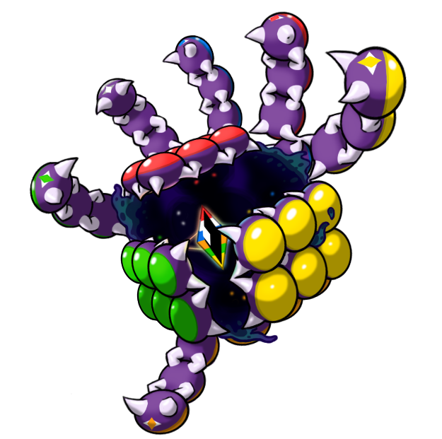
Mos-Quitoxe: This is like a demonic rubix cube being opened up. Really interesting design that catches my attention.
Quan: Reminds me of a cuphead boss. I think you can go with some louder colors in the body but that might be oversaturated?
shadow shocker: Loved your Mias design, and this one also sticks out to me. A poisonous punk rocker? That concept worked in the past but this is better than anything Roxie did. My only ideas would be changing the tip of the tongue to try and look like a guitar pick and tail piercings.
Ylix: Reminds me a lot of Cruci in a good way. the pain brush tentacle tips is detail I like.
But there is no Birkal design which is sad :(
Now that I have some time, been looking at some designs. And liking a lot of what I see.
But here are some thoughts/shoutouts I have:
Note: Please take what I say with a grain of salt. I suck at drawing and art.
Darek851: Has a hyper urban aesthetic to it like in. The black base is a great canvas for the cyan, neon green, and purple that grab my attention. some of those colors I also associate with poison.
+ Radio waves for eye balls to fit with the headphones? And spray paint cans for fins?
DougJustDoug: I like the base design but really needs colors to make it pop. I know its a WIP. + those coins it has look like gym badges.
Maybe use actual gym badge designs?
Explosion Badger: The rainbow coloring really sticks out to me but the rest of the color choice feels a bit muted. Maybe try and use the rainbow color a bit more?
Mos-Quitoxe: This is like a demonic rubix cube being opened up. Really interesting design that catches my attention.
Quan: Reminds me of a cuphead boss. I think you can go with some louder colors in the body but that might be oversaturated?
shadow shocker: Loved your Mias design, and this one also sticks out to me. A poisonous punk rocker? That concept worked in the past but this is better than anything Roxie did. My only ideas would be changing the tip of the tongue to try and look like a guitar pick and tail piercings.
Ylix: Reminds me a lot of Cruci in a good way. the pain brush tentacle tips is detail I like.
But there is no Birkal design which is sad :(
- Status
- Not open for further replies.