


We've hit sprite land.
Our CAP so far:
Stat Spread: 90 HP / 85 Atk / 80 Def / 105 SpA / 80 SpD / 110 Spe
Abilities: Volt Absorb / Lightningrod
Rules
Failure to follow these guidelines will result in the submission being disqualified and the post will be deleted.
Sprite submissions for the sprite poll will be selected by the Topic Leader, based on preference and feedback in this thread. There is no process for overturning the Topic Leader's decision. If you are not comfortable with this stipulation, then do not make a sprite submission. Do not post any complaints here or in later threads.
Additional Information
There are 8 possible sprites:
Animations are not required and will not be used as part of the final product; however, it does add to the "appeal" aspect of your submission.
You do not have to make different Male and Female sprites, but it helps. Since there are only minute differences between most in-game male and female sprites, it’s not very hard to tweak the sprite for a different gender. Some spriters have made noticeable changes between genders, and that’s fine too.
Shinies are just recolors, so that’s not too tough. There’s lots of people that can’t scratch, that are willing to recolor your shiny, if you really don’t want to do it yourself. Just ask in the submission thread and you’ll get plenty of offers to help.
Please look at your transparent sprites against different colored backgrounds, not just white. In Shoddy, the sprite will be displayed on multiple background colors in the Team Builder and in battle.
Most important: do not quote sprites.
Our CAP so far:
Typing: Fighting/DarkName: Perfect Mate
General Description: Pick a good-but-not-great OU pokemon, and design the perfect teammate for it, similar to the way Celebi & Heatran, or Blissey & Skarmory complement each other so well on competitive teams.
Justification:
This would allow us to explore in detail how synergy between two pokemon can be achieved, because currently there are only a few perfect teammates in OU. And depending on the base pokemon we choose to give a "perfect mate", we can open a new niche in the metagame based around the efficient pairing.
The niche we create will be inherently tied to an existing pokemon in the metagame, which should provide a natural limitation to prevent this concept from being broken or "too different" from standard OU.
Questions To Be Answered:
- Is the base pokemon's usefulness (and usage) in the metagame increased as a result of having a "perfect mate"?
- What strategies are more effective for the base pokemon, as a result of having a perfect teammate?
- What are the most effective aspects of the new pokemon, for purposes of making a great teammate with the base pokemon?
- Is the new pokemon viable in the metagame without the base pokemon as a teammate
Stat Spread: 90 HP / 85 Atk / 80 Def / 105 SpA / 80 SpD / 110 Spe
Abilities: Volt Absorb / Lightningrod
Rules
- Sprites should be inspired by the winning design from the Art Poll. It does not need to be an exact rendition of every detail of the design; "artistic license" is granted to all spriters. However, drastic deviation from the selected art design is discouraged.
- All sprites (front and back) can have a maximum size of 80x80.
- All sprites (front and back) must have a complete, unbroken, distinguishable outline. It does not need to be a black outline, but it must be clearly distinguishable from the adjacent interior colors of the sprite.
- No action effects, move effects, environment effects or additional objects can be rendered on or around the pokemon.
- Sprites must be in PNG format.
- Use 8-bit truecolor (aka 8-bit RGB) or less. This does NOT mean 256 color mode.
- Use transparent backgrounds.
- Fusions of other sprites are not allowed. All sprites must be scratch sprites.
- Do not alter, fuse, recolor or otherwise modify another spriter's submission – unless the original artist explicitly gives permission.
Failure to follow these guidelines will result in the submission being disqualified and the post will be deleted.
Sprite submissions for the sprite poll will be selected by the Topic Leader, based on preference and feedback in this thread. There is no process for overturning the Topic Leader's decision. If you are not comfortable with this stipulation, then do not make a sprite submission. Do not post any complaints here or in later threads.
Additional Information
There are 8 possible sprites:
- Front Normal Male
- Front Normal Female
- Front Shiny Male
- Front Shiny Female
- Back Normal Male
- Back Normal Female
- Back Shiny Male
- Back Shiny Female
Animations are not required and will not be used as part of the final product; however, it does add to the "appeal" aspect of your submission.
You do not have to make different Male and Female sprites, but it helps. Since there are only minute differences between most in-game male and female sprites, it’s not very hard to tweak the sprite for a different gender. Some spriters have made noticeable changes between genders, and that’s fine too.
Shinies are just recolors, so that’s not too tough. There’s lots of people that can’t scratch, that are willing to recolor your shiny, if you really don’t want to do it yourself. Just ask in the submission thread and you’ll get plenty of offers to help.
Please look at your transparent sprites against different colored backgrounds, not just white. In Shoddy, the sprite will be displayed on multiple background colors in the Team Builder and in battle.
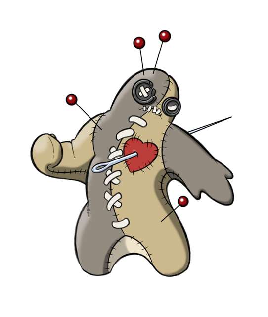
A few notes to spriters on the design...
Since I sprite myself, there are a couple of aspects to the design that I made with the game sprite in mind:
Good luck with the sprites!
-Doug
Since I sprite myself, there are a couple of aspects to the design that I made with the game sprite in mind:
- The red pins are moveable on the design. I specifically mentioned in my backstory that the pins might be able to work like Spinda's spots or perhaps Unown's shape, and their positions be determined by the pokemon's IVs. In reality, that line was included to allow the spriters artistic freedom to put pins where they fit best in the sprite. You may notice in the two support art pics, that you cannot see a pin in the doll's right shoulder. Because it would have interfered and cluttered the pose. So, feel free to put pins where you want. The number of pins is variable, since there may be unseen pins stuck in the pokemon's back, etc. Creative license granted.
- The voodoo doll was explicitly designed to look like a patchwork combination of multiple colors of material. In that same vein, I think this pokemon could possibly have different colors for male and female, just like Hippopotas and Hippowdon. For any individual color scheme -- I tried to create the illusion of multiple colors, while still keeping a small core of base colors. But in order to create a full "patchwork quilt" of colors, perhaps gender specific colors make sense for this pokemon. Not a requirement by any means, but I had it in mind when I came up with the base colors.
- If you find yourself struggling with the number of laces or big stitches on the pokemon's chest and abdomen -- feel free to omit one or two on the sprite. I honestly wanted to put less of them on there, because I knew spriting that many would be a chore. But, it was harder to understand what they were on the full-design, so I added a couple more than I really wanted. Obviously, you can do whatever you want with the front stitching, but I'm here to say you have the original artist's full permission to simplify it to make the sprite more manageable.
- "Ambiguous shaped hands" was something I really didn't intend when making the design. I intended the hands to look pretty much like mittens. But, I've done a lot of cartoons in the past where mitten-handed cartoon characters can "spread their fingers" for effect. So, I usually just stretch a pinky finger or index finger from the main "mitten", to create the illusion of spread fingers. That's what I was doing in this design on the pokemon's left hand, and I didn't really intend for it to be a big deal. But several voters pointed out specifically that they liked or disliked that the design appears to have "amorphous hands". If that's the way you want to interpret it, go ahead. I obviously drew an extra finger-like appendage there on the left hand, so I can't take that back. But, all my concept drawings and support art have the pokemon with mitten-like hands, not some amoeba-like blob.
Good luck with the sprites!
-Doug
Most important: do not quote sprites.


