First of all, I would like to extend a round of applause to DougJustDoug for his well-deserved victory in the art polls. Well done, man, well done!
Now that what I needed to say was said, onto the first round of my comments and criticism for CAP 11…
Aragornbird:
I have to be frank and say that I couldn’t agree with Xatu fan (and a few others) more: I think your pose is excellent. It portrays the fact that this Pokémon is intended to attack using the sewing needle to attack (either as a wand or a sword). If you want to try other poses, though, that’s fine.
Obviously, shading this piece is in order, though I presume you are already doing that. I should point out, though, that the sewing needle is missing its eye. Adding that would do your piece plenty of favors.
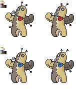
Elevator Music:
I see that you have (apparently) decided to base your pose off of one of DougJustDoug’s supporting pieces. There’s nothing wrong with that as far as I am concerned: in fact, I think your sprite is a wonderful rendition of that pose. The colors are also spot-on. I also like the shiny colors you are proposing here: I think they work very well.
I kinda had to study your female sprite for a few minutes before I realized what the difference between that and the male was: the varying lengths of the pins, as you stated in your post. If you were going for being subtle, great, but if not… well, it certainly is not obvious. What is also not obvious is whether or not the right eye button is broken. Making that a little more clear to the viewer would help your piece (and the viewer) a lot.
Tombadil:
Wow. For your first-ever sprite, I have to say that this is a pretty good piece. I applaud you for your willingness to come on here and show us your work. It has plenty of potential, that’s for sure. The pose you are going for is certainly an interesting concept.
I’ll just start with the more important issues first and go from there: we have plenty of time to work with here. First of all, when you enlarged your sprite, the image became blurry. The original, smaller sprite looks better in terms of image quality: if you want your sprite to be larger (and I think you should go with the larger sprite, frankly), I would recommend doing a pixel-over with it. Second of all, your sprite has a bad case of what is sometimes called “the dots.” In other words, there are places where the sprites outline looks broken and appears to be a dotted line. This is a touch less prevalent in your enlarged version, but it is still there.
Overall, this is a great start and an excellent first sprite. It certainly would be worth your time to work on it because I think you will come out with a strong piece in the end.
Big Poopa:
I really like the pose this sprite has. It works very well with this Pokémon, methinks: it’s kinda floppy, like a doll, but still lively. The color choice for the lighter fabric and the heart are well-chosen.
The coloration of the darker fabric, however, appears to be too brown. Looking at DougJustDoug’s artwork, the darker fabric is actually a grayish-brown color. In order to remain faithful to the original design, I would suggest that you go with a bright shade of a grayish-brown. Obviously, you’ll also need to add the eyes.
---
All in all, I am really liking what I am seeing so far. I am really excited to see how these sprites turn out in the end. As always, I only comment because I care and want to make these sprites the best pieces they can be: whether or not you follow any suggestions I give you is completely up to you.